 This post is one of a series of blog posts from the first ONA class of MJ Bear Fellows describing their experiences, projects and sharing their knowledge with the ONA community. Fellow Lucas Timmons is a data journalist and web producer for The Edmonton Journal in Edmonton, Alberta, Canada.
Data journalism can be very compelling. Stitched with a good narrative, it can tell one amazing story. But we can do better than that. We can also visualize the data and provide a great package. With that in mind, here are three free options for creating animated and interactive charts.
Google charts API
Google offers great, free and easy chart building tools. There are 14 different types of visualizations in all to choose from, including bar charts, bubble charts, treemaps, gauges and tables.
The charts can be made interactive or static and used in print as well as online. Google also provides a quick start guide so designers can get up and running. All the code is included — just modify it to suit your needs.
Google tries to make this very simple and accessible. Even if your knowledge of HTML and JavaScript is limited, you should be able to use Google charts easily.
JIT
The JavaScript InfoVis Toolkit is a JavaScript library that includes code for area, bar and pie charts, sunburst charts, icicle charts, force directed graphs and tree maps.
The data for the charts is created in JSON. To get the visualization to appear, just attach the .js file with the JSON in it to your page along with the core files. Create a div for the visualization and you’re done.
The project’s documentation is easy to understand and does a great job explaining how to quickly make charts of your own. Some understanding of coding is required.
The project uses an open source license (BSD), so you should be able to use it on your website for free.
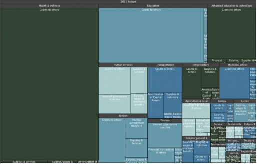
A treemap visualizing the 2012-13 Alberta budget. Made with with JIT.
Edmontonjournal.com used this library last week during the Alberta budget lockup to create a treemap of the 2012-13 budget.
d3.js
For the more advanced designer, there is the d3.js library. Created in 2010 by Michael Bostock, it’s free for designers to use on their sites.
The library can be used to create calendar charts, chord diagrams, choropleth maps, non-contiguous cartograms, treemaps and much more.
This library is a bit more complicated to use, but also much more powerful. It can be the backbone of a major data visualization.
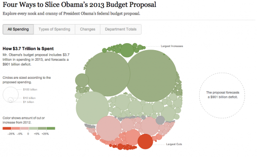
The New York Times’ budget breakdown visualization created by Shan Carter using d3.js.
Shan Carter of the New York Times recently created an incredible budget visualization using the d3.js library.
Conclusion
Regardless of which library or method you use to create visualizations, remember the journalism. Great-looking charts that don’t convey much aren’t very useful. Technology is wonderful, but always be mindful of whether it’s helping you get the message right.
Do you use other methods or libraries to create interactive? Let me know in the comments.