 This is the first in a series of blog posts from the first ONA class of MJ Bear Fellows describing their experiences and sharing their knowledge with the community. Lucas Timmons, a 2011 MJ Bear Fellow, is a data journalist and web producer for The Edmonton Journal in Edmonton, Alberta, Canada.
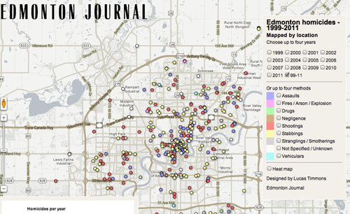
Edmonton homicides – 1999 – 2011
It was a particularly rough year for homicides in Edmonton. In 2011, the “City of Champions” was Canada’s homicide capital with a record-breaking 47.
As the year was wrapping up, we decided that the standard year-end wrap-up wouldn’t suffice for such a dreadful year. The Journal decided to publish a larger year-end project on homicides, and I was to supply a way to visualize it online.
This map is what I ended up creating. It fit in as a piece of the larger project.
This post isn’t a tutorial how-to for the map. It’s more of an outline of how I got from point A to point B with the lessons I learned along the way. If you’re looking for a tutorial on how to do this, let me know in the comments. If there’s enough interest, I could show specifics in a future post.
We had been using Dipity to keep a running timeline of the homicides in 2011. The idea was simple enough. We wanted anyone who read a story about a homicide in Edmonton to see where it was, who the victim was, when it happened and to have a link to the full story.
This worked well for us, but Dipity’s limitations, as well as some service outages, left us looking for a better answer. We also had decided we wanted something larger.
With that in mind, we started looking for a better way to tell the story. After some discussion with one of the Journal’s (then) crime reporters, Brent Wittmeier, we decided to find all the data we could before trying to decide what story we wanted to tell. Using our newspaper’s archives and paper records that earlier crime reporters kept, we were able to gather information on all the homicides in the city since 1999.
Using Google docs as our collaboration tool, we went to work filling in the details about every homicide. Brent handled the bulk of the work. When we took a look at the data set, it was pretty impressive. Edmonton had had 364 homicides since the start of 1999. We had information on the location, the method, the victim, his/her age and whether it was solved. It was at this point that we decided how best to visualize the data.
We had talked about a timeline, spanning 1999 to 2011. I made a simple mockup using ProPublica’s TimelineSetter. The idea was that the readers could choose from check boxes what type of homicide they wanted to see, and the timeline would be populated.
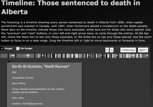
An example of ProPublica’s TimelineSetter
TimelineSetter allows you to put whatever code you like in the in boxes for each entry. We were able to enter all the information we had, plus a map link for each entry. Even better, the data was already in tabular format, so getting it into Timeline Setter was easy. We were lucky to avoid this trap.
With deadlines looming, sometimes we make decisions about what to do based on how easy it is to get the job done, rather than if what we plan to do makes the most sense for a situation. While Timeline Setter is awesome, (We’ve used it here) it wasn’t the best tool for the data we had.
Because we had location information for each homicide, and we had the method for each homicide, we decided that a map would be our best bet. This gave us multiple ways to visualize the data. We could show homicides by location, but also allow readers to pick the context. They could choose the year, a yearly comparison or the method used. We also were able to take the location data and map it against the city’s neighbourhoods so that we could find out what areas were disproportionately affected.
I got to work building the map. We don’t have access to ArcGIS and we’re limited with tech infrastructure because of Postmedia’s centralization and IT security policies, so we needed a solution that was free and could be hosted off site. I have had success with Google Fusion Tables before, so that became our platform. (Incidentally, Kathryn Hurley from Google, did a great presentation on getting started with Fusion Tables at ONA11.
I cleaned the data that Brent and I had put together and uploaded it to Fusion Tables. I wrote some simple javascript to add a legend to the map that allowed users to choose what year they want to appear on the map. For this, I had uploaded the data from each year into a separate table. I colour coded the points with the legend based on the type of homicide. Then, I sought other staffers’ advice.
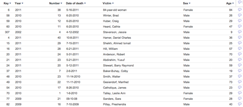
The homicide data in Fusion Tables
This step is was very important. Get your basic idea built quickly and then start asking everyone who will listen for advice. If you’re reading this, you’re probably not representative of the average user of your site. Users are going to want to know different things than you do, and they will use the data differently.
It wasn’t very long before I had a bunch of changes to make to improve the map. I was very happy that I had just shown a very basic model of what I was trying to do. The suggested changes were good and forced me to review how I was going to put the data online.
The data was easy to see, but difficult to understand. Seeing 364 dots on a map will show you there were a lot of homicides, but have you ever tried to count 364 dots — some of them overlapping — on a map? I had failed to realize that without the proper context, the dots would be meaningless.
The other big suggestion was that perhaps readers would want to see just what type of homicides had happened by location. So I had to add a method to show just the shootings, or just stabbings. Obviously having each year in a separate table was not going to cut it — especially not if I had to do that for each method, too.
It was at this point that I dove into the Fusion Tables API.
Saving you the technical details, I rewrote the queries that get the data from Fusion Tables and consolidated the data into a single table. This included adding some extra information into the table. (If you really want the technical nitty-gritty, email me and we can talk.) That brought the total number of tables down to just one, and it simplified the code I had to write.
I now had a method for showing just the year, or just the type of homicide, but still no way to display the numbers. I decided that simple bar charts would be the way to go in this case. The plan was to have them appear on the map each time a modifier was selected. So if you picked just the 2003 homicides, a chart would appear showing you how many homicides by each method occurred in 2003. If you picked stabbings, a chart would show you how many stabbings had occurred in each year.
As my budget for this remained at $0, the best place to look was Google. The Google Charts API gave me exactly what I wanted. It was easy to use and easy to embed.
Things were looking up, but the deadline was fast approaching, and I was far from done. It was at this point that I stopped looking for elegant solutions in my code and started looking for brute force code that just worked. This was probably my most valuable lesson: Build in more time!
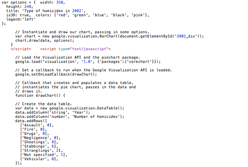
The code. Well, just a few lines.
Instead of creating a nice compact function that when passed a variable, would create the chart and set the map, I had to write multiple similar functions with different values. I had run out of time, the function wasn’t working and I needed to get it done. Again, the lesson here is to build in more time for debugging and troubleshooting.
The final, and probably most difficult part of the map was the heat map function. Since we do not have access to ArcGIS, I had to do the spatial join in QGIS. That was more difficult than anticipated, and was complicated by some incorrect geocoding of points.
I had exported the points from the Fusion Tables document as a KML file. When I had geocoded them in Fusion Tables, it had appeared that all of the points were properly geocoded. So I was working under the assumption that they were all in the right place. WRONG.
Yet another lesson learned specific to mapping: Check to make sure things are showing up where they are supposed to.
Google is a bit particular as to how it handles addresses for geocoding, and Edmonton’s streets run on a confusing grid system. When confused about an address, Google put the point in the middle of the city. It did this with multiple points, but since they were all at the same latitude and longitude, it appeared as a single point.
It took me a while to figure out why one neighbourhood was reporting a huge number of homicides with so few points. I originally had thought it was a projection issue, and spent a good deal of time trying to determine if the KML and .shp files I was using had different projections.
Here’s another lesson: Don’t be afraid to ask for help. I am certain that if I had posted this on the NICAR-L some very smart person would have quickly shown me the error of my ways. Instead, I struggled for hours on something that took minutes to fix.
After making the address changes in the Fusion Tables document, and once again exporting the data as KML, I was able to get it into QGIS and run a spatial join with the neighbourhood shapes. I uploaded the shape file to Fusion Tables with Shape to Fusion and added the code to display it on the map.
From there, I just had to get the map online and then add the text for how to use the map. It’s here that my boss, Kerry Powell, constantly reminds me to be better. I suck at writing explanation text for how to use something. I know I do. I need to get better at it and I’m working on it. Kerry very graciously helps me out every single time I create something. Another lesson here: You could make the most awesome widget in the world, but if your readers don’t know how to use it, they won’t.
This also was where copy editing came into play. All the points on the map, when clicked, bring up a popup box with information about the homicide. All that text needed to be copy edited before we put it online. Sometimes the designers/coders/data journalists/whatever can get so caught up in getting something online and working, that tasks like copy editing get pushed aside. It is very important to remember this when trying to determine how long a project will take. Again, this is another lesson learned about building time into the schedule.
Looking back I think we made the right decision about how to visualize the data. Using these tools not only gave us a nice visualization, but also served to help the reporting.
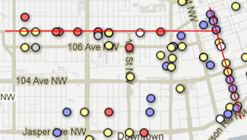
Specifically, the heat map confirmed what had long been thought about the downtown core of the city: Downtown Edmonton is “Deadmonton”. It also disproved the reputation that one area of the city had picked up: Millwoods is not “Killwoods”. The points also gave us an interesting look at homicides over time. We were able to see that along 107th Avenue and 86th Street, there exists a corridor of death. This information was included in one of the year-end wrap-up stories about where homicides happen.
In the end, this project turned out to be a lot more work than anticipated. If I had to do it over, I would have built in more time for revisions and coding. I also would have brought more people on board earlier to try and determine what we were trying to visualize. Working out an idea is great, but if the idea keeps changing, you’re never going to finish.

