 This is one of a series of blog posts from the first ONA class of MJ Bear Fellows describing their experiences and sharing their knowledge with the community. Fellow Lam Thuy Vo is a multimedia journalist based in New York.
Animations are in! International organizations, advocacy groups and journalists have come to embrace motion graphics as a means to explain complicated issues. And I’ve come to love them, too.
For a project on privacy issues, my friend and investigative journalist Stokely Baksh and I created this animation:
Full disclosure: I’m no expert in motion graphics and have only worked on a small number of animations, but here are the lessons I’ve learned along the way.
Relationship between Infographics and Animations
In my humble opinion, the best use of animation is done when moving graphics are used to explain concepts and stories. This could be images of people and objects moving to “act out” what is being said in a voice-over. Or it could mean animating an information graphic (a how-it-works graphics, maps or charts) to illustrate a point. A lot of animations out there move words that are spoken, which is a great way to keep a long and boring speech visually interesting, but I get much more excited about animations that use graphics and illustrations in interesting ways.
This whimsical animation, for instance, was one of the first that inspired me to start incorporating animated charts and data visualizations in my work:
http://www.youtube.com/watch?v=Au0Ue7qCy6k
Video by Japanese artist and designer Kenichi Tanaka.
The Little Things Matter
Another friend of mine who studied traditional animation (a la Disney and Looney Toons) brought my attention to the “12 Principles of Animation,” laid out in the book “The Illusion of Life: Disney Animation,” which, according to my friend, has become a bible for animators.
When I first started fiddling around with animations I was just estatic to have made objects move into the frame at variant speeds. But little things — like easing in a motion or making an object bounce — can make a difference in how dynamic your animation can be or in how realistic a motion seems. The stylistic devices presented by the authors of the book are not crucial to making your story clear and lucid; your reporting, story and script are. But they can help you polish your work, the way a broad vocabulary and varied sentence structure can keep a reader interested in an article.
There are also a number of other fancy effects that can be used very effectively in conjunction with information graphics. You can generate a large number of the same object to show scope. You can track the movement of a person on a map through a line or a dot to show where they are going. You can have bar charts grow to show how the value of something increased over time. Those are immensely useful effects.
But then there are the small effects which last only two to three seconds and can take you hours to figure out. It’s painstaking, but it’s like solving a mathematical problem: once you find the value of ‘x,’ you’re immensely satisfied.
For specific effects, I’ve been told by various of my animator friends (commercial and journalistic) that this site is great for tutorials.
In this animation about the toll of the 2011 earthquake and tsunami in Japan, I had to wrestle with all sorts of small things, such as creating a small dot representing the epicenter of the earthquake that emanated radio waves to show how the earthquake spread. It was the first time I had used After Effects and I spent nights alone in the office, trying to figure out little things like that.
Workflow
So now you’re excited about animations but don’t know where to start? In those scenarios, Google is your best buddy.
When I Googled “animations” and “journalism,” I quickly stumbled upon a tutorial by Zach Wise, a New York Times videographer and multimedia instructor. It’s been possibly the best and most straightforward guide I’ve found for journalists who aspire to be animators.
Here’s his animation reel:
The process involves a lot of pre-production: nailing down a solid and accurate script, storyboarding the piece, producing all the graphical elements (lots of Illustrator and Photoshop work), preparing the audio track and then finally animating the piece. Understanding this process is crucial in knowing how long it takes to create animations. It also helps you gauge whether it’s worth undertaking such a tedious task or whether you might want to stick with something simpler.
Consume
Last but not least, it’d be worth seeing what other news organizations have done in the field. Here’s a short list of my favorite uses of animation in journalism:
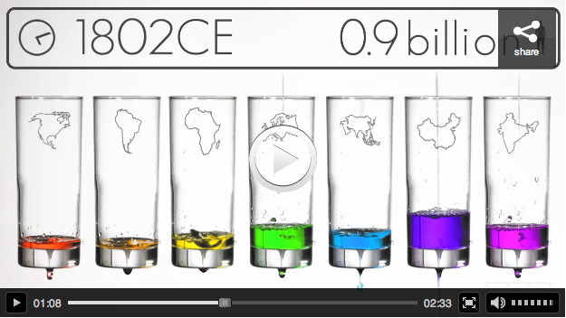
NPR’s beautiful “Visualizing How a Population Grows to 7 Billion“:
The Guardian’s Stop Online Privacy Act explainer:
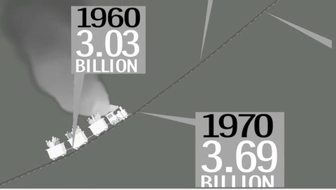
The Washington Post’s “One in Seven Billion“:
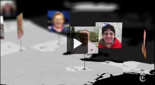
The New York Times “Choosing a President“:


