Comics are having their moment in the journalistic sun. Erin Polgreen’s idea for a tablet magazine dedicated to illustrated journalism recently won the 2012 New Media Women Entrepreneur grant from the Robert R. McCormick Foundation. And comics — and their journalistic applications — took over SXSW. But webcomics are a slightly different animal. Not necessarily looking for mainstream recognition, many webcomics are defiantly indie, surviving on hard-won ad revenue and a loyal fanbase. So what can journalists learn from these scrappy web pioneers?
Rethink site layout
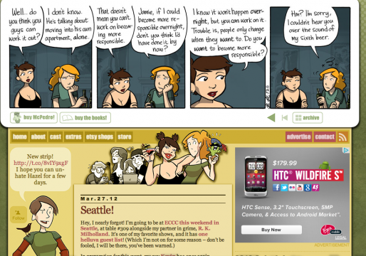
Static, functional portfolio websites are the path of least resistance. But sometimes, with a daily stream of content, creators are forced to prioritize. So how do you easily keep your site looking fresh while still producing work? Webcomics sites blend styles, incorporating the most recent work, comments and social media all in one central location:
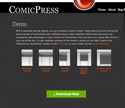
In the years since webcomics hit the scene, a dedicated extension called ComicsPress has popped up to help fledgling creators format their blogs. This one is from Girls With Slingshots, a webcomic by Danielle Corsetto that has been running since 2004.
Need some suggestions to guide your own digital reboot? Mediabistro’s 10,000 Words has seven premium WordPress themes for journalists and photographers.
Flip a concept
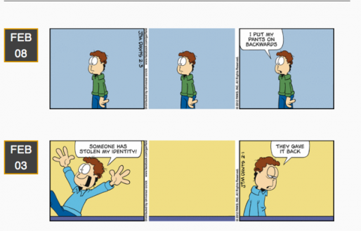
The success of Garfield Minus Garfield was sudden and unexpected.
Garfield Minus Garfield is a site dedicated to removing Garfield from the Garfield comic strips in order to reveal the existential angst of a certain young Mr. Jon Arbuckle. It is a journey deep into the mind of an isolated young everyman as he fights a losing battle against loneliness and depression in a quiet American suburb.
Dan Walsh curates the site, but notes he is not the originator of the idea — for years, the idea of removing Garfield from the strip lived on message boards. The ideas gained traction and Walsh stepped up to create a home for all of them. Luckily, Jim Davis, the creator of the Garfield franchise, is a fan.
Re-explore the serial format
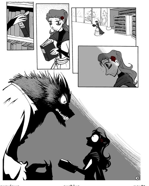
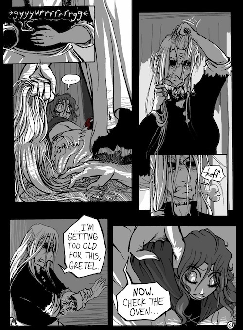
No Rest for the Wicked takes classic fairy tales for a spin, revamping classic characters like Little Red Riding Hood and Hansel and Gretel. Creator Andrea L. Peterson has inked the comic since 2003, slowly and deliberately telling the tale of a cursed princess and her quest for a good night’s sleep.
While series are a well-worn part of journalism, figuring out how to break stories into compelling, edge-of-the seat mini narratives is quite difficult. Webcomic artists need to keep their readers coming back each day, and many use their storytelling skills to put together a well-crafted continuing story.
One note of caution: Serial writing is a painstaking undertaking, and while the urge is to immediately share the work, it can lead to frustration and disappointment. No Rest for the Wicked has a strong fanbase, but Peterson also took many months off between comics, particularly in 2010 and 2011, leading readers fearful that the comic was dead.
Want more specific tips? Check out Julie Miyamoto’s “Learn from my mistakes” section.
The devil is in the details
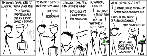
XKCD is a webcomic that broke into public consciousness with its smart asides into geek culture, and one interesting feature — creator Randall Munroe uses stick figures for his main characters. For many in the comics industry, the art is the primary focus of a comic, but that isn’t true in the webcomic world, where concept, topic and punchlines can count for far more.
However, this doesn’t mean image doesn’t matter.
Joel Fagin of Between Worlds assembled the best advice for aspiring web comics. Here are three standouts.
Can’t draw? Oddly enough, it doesn’t matter.
Webcomics are a hobby and generally a way of practicing and improving your artwork. As such, people typically understand if the artwork is not quite up to par. In fact, they usually understand if the artwork is absolutely terrible.
Unlike bad artwork, bad writing can kill a comic pretty quickly. That’s not to say you have to write something deep and meaningful, with layered characters and an engaging plot. You just have to write something competently. It can be as shallow or as profound as you like, but it can’t be stupid
Odd as that may sound, but a professional finish to your webcomic counts for more than good artwork. And by this I mean that the image would be scanned cleanly, shouldn’t have smudges, smears or pencil lines showing, and you should create speech bubbles, borders, text and so on in an art program rather than with a pencil. You should check your spelling and grammar, avoid internet abbreviations (LOLZ!!) and “leet” speak.
That pro gloss isn’t just for webcomics — taking the time to polish your pieces and their presentation can make all the difference when people are exploring your body of work online. Invest the extra time to find the right site format, the best way to present your media and compelling reasons for people to return.
Interested in learning more about the intersection between comics and journalism? Our upcoming ONAvation webinar with Erin Polgreen of Symbolia Magazine is a perfect place to start. She’ll show you how visual journalism can generate web traffic and provide a engaging entry point into complex stories.

