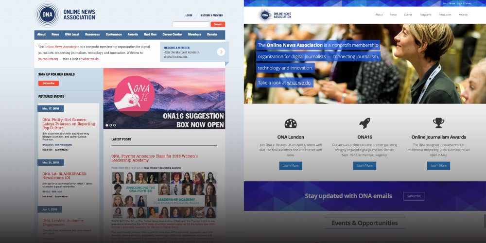
We started this project more than a year ago, when our old website was showing its age: cluttered content, unorganized menus and a front page that no longer showcased our work with efficiency and ease. Our analytics told us that you were most interested in our conference and other live events, the Online Journalism Awards, our fellowships and our myriad resources for journalists. We realized our site could do a much better job of helping you find what you need quickly.
So we went through the steps of a redesign many of you know so well. We brainstormed and strategized. We considered the different users who come to journalists.org: journalists, ONA members, students, designers, coders, executives, educators, technologists and more. We discussed how a redesigned site should tie into our mission of inspiring innovation and excellence among digital journalists to better serve the public.
In the end we developed a new home that reinforces who and what we are — a nonprofit organization for every digital journalist — while quietly guiding you to the things that matter most. And we do it all on a responsive WordPress site that looks great on mobile.
Here’s a closer look at some of the new features:
Fully responsive website
Our biggest goal with this redesign was enabling our website for mobile devices. While our industry at large crossed the 50 percent mobile mark long ago, the association space is a bit different. In 2015, about 20 percent of our audience came from mobile devices. (And yes, we realize that perhaps some potential traffic was deterred by a non-responsive site.) That number has grown every year, though I suspect it will continue to lag behind traditional news outlets. Regardless, it’s 2016 and we were out of excuses. Time to ensure journalists.org worked on the go.
Regardless, it’s 2016 and we were out of excuses. Time to ensure journalists.org worked on the go.
Highlighting featured posts
ONA publishes certain content that we already know will get heavy traffic — any posts or resources from our conference, our Online Journalists Award finalists and winners, our Women’s Leadership Academy and Challenge Fund programs generate a lot of interest.
On our old site, those posts would often get bumped by our more regular content. So today you’ll see a Featured News section of the homepage that gives select news a little more hang-time.
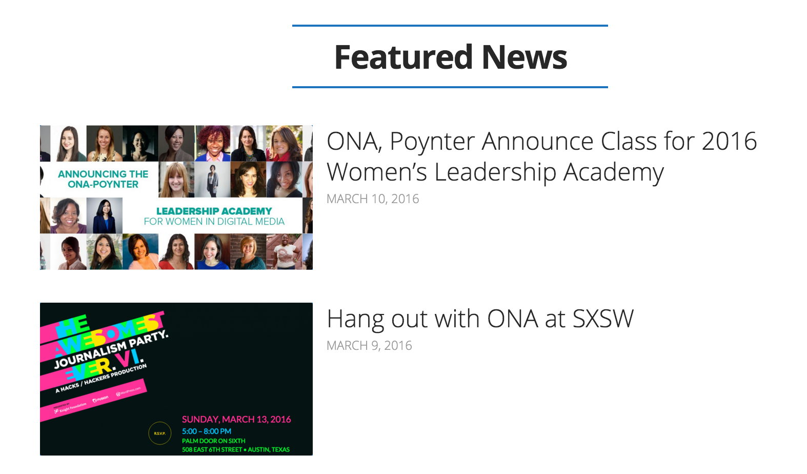
Our featured news section on the home page gives select content more hang-time, without getting pushed off.
More photography and visuals
We’ve got a lot of great content on journalists.org. But no matter how good it is, your eyes need a break from text at some point. On the old site, it was a challenge to find graphics, photos and other visuals to seamlessly publish alongside content. We thought a lot about layout, and how WordPress’ featured images feature could be used throughout our content. Like this post or this page. We gave the front page itself the most consideration, and I think it shows. Full-width graphics, subtle differences between sections and efficient use of headings and buttons help you flow down the page with ease. We’d like to think it’s even enjoyable.
Well-organized navigation
Perhaps one of the more effective-yet-subtle changes is how we’ve restructured our main menu. On the old site, things got a bit bloated as we squeezed more and more pages into a rigid setup (we’ve all been there, right?). There was space for the conference, for ONACamps, for various resources, for information about ONA itself, for membership and much much more.
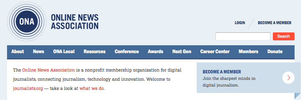
Navigation on the old site had far too many options — including dropdown menus not pictured here.
The “Next Gen” tab, for example, was meant to include ONA programs geared toward the next generation of digital journalists. Does Women’s Leadership Academy fit that model? What about the ONA Local program? Now, you’ll find a simple option: Programs. Combined with a new header for Events, and a revamped version of the Awards section, you should be able to find what you need quickly.
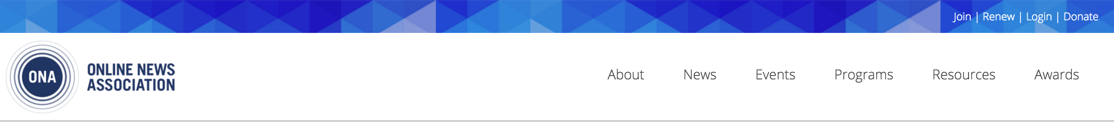
We hope this navigation is a bit more pleasant to use.
Across the board, we hope the menu is a more intuitive tool to quickly get you where you want to go. And if that fails, our search is a lot more efficient now, too (look for it in the footer or sidebar).
We’d love to hear your thoughts or suggested improvements. UX has been a big focus throughout this redesign and we’ll continue to fold it into our upcoming improvements. You might notice us rolling out smaller updates over the coming months. Until then — can’t find something? Love what you see? Want more? You can email me at jeremiah@journalists.org.