There are many schools of thought on how to improve commenting on the internet, most of which focus on trying to convince commenters to be more civil. But ReadrBoard turns that idea on its head, asking commenters to be more specific. And doing that, it found a whole new way of looking at the process. Co-created by Porter Bayne, Tyler Brock and Eric Chaves, ReadrBoard aims to change the face of online conversation as we know it. After a successful beta test on news site Hypervocal and (full disclosure) Latoya Peterson’s site, Racialicious, Bayne, Brock and Chavs decided to revamp the overall design and user interface in 2012. Here Bayne explains the concept behind ReadrBoard, discusses redesign on the fly, and shares a visual history of ReadrBoard’s evolution.
What was the main idea behind ReadrBoard? How did you and your cofounder come up with the concept?
At ReadrBoard, we all think that all reader engagement — a share, a Like, a comment, a bookmark, a copy-paste, anything — is preceded by some emotion or thought: “That’s funny,” or “no way,” or “really?” or “my friend would love this,” and so on and so on. And we’re sure that far more readers have a reaction to content than are currently Liking, commenting, etc.
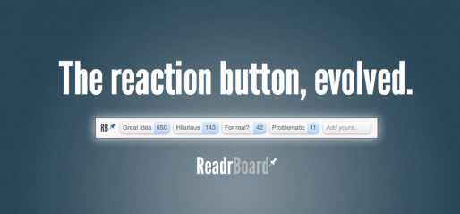
So, ReadrBoard is working to make it simple for readers to do that: react to content, with just a click. Sort of like a Like button … but any emotion or thought. And you can react to the whole page, or any part of a page.
For me, the idea was distilled out of a few years of prior work I did on an annotation / inline commenting application — I’ve been driven by improving the context of all content web-wide: Let’s be smarter consumers of everything, from shopping to public policy.Tyler and Eric share that, and had their own initial spark that got them on the project, too. For one, Tyler simply sees value in the idea of more targeted engagement: why must I “Like” or comment on a whole page? There has to be a smarter way. And Eric has been thinking for years on how to make ratings systems more accurate and more self-descriptive (“c’mon, what does it mean to say a restaurant is 3 stars?”), while still being easy to use.
We all met through the NYC tech/startup scene, got along great, and shared an interest in where ReadrBoard was and was headed, so decided to give up a year or more of our lives bootstrapping together to see what would happen.
What happened during your launch period?
It’s been an ongoing launch process. We like to get the product out and into the hands of real communities and really learn how it works and what doesn’t work. Even before launch, there has been a wide range of interest from publishers and advertising networks, validating the interest in what we’re doing. With ReadrBoard, the question is not, “is there value?” The question is, “will enough readers use it to create that value?”
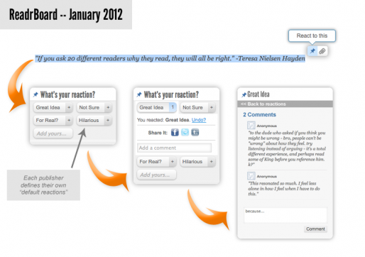
We definitely moved quickly to add functionality once the beta product launched to a few sites. For example, the content at Racialicious is long and thorough, and it can take some hunting to find where on the page the reader reactions were happening. So we created, in about a week, the “Summary Box” that sits on a page and summarizes all the reactions on a page for the reader. (That) helps the reader know if they want to read more deeply on that page.
Then, at HyperVocal.com, whose content is sometimes pretty short, we often found ourselves and other readers wanting to simply say, “this was hilarious” or “interesting” or whathaveyou to the whole page. So we made the Summary Box interactive: Click a button, react to the whole page.
Both of these were thoughts that had occurred to us, but once out in the wild, they shot straight to the top of the priority list.
Right now, we have a new version of the user interface about to launch that is easier to use, better-looking and takes up less space once the reader has started reacting.
At what point did you realize you wanted to change some of the functionality?
We’ve gone through a few conceptual changes and a handful of design changes.
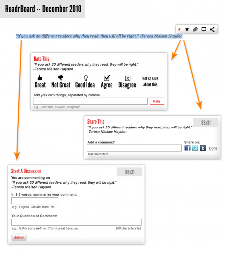
The biggest conceptual change we had was realizing that the reaction precedes everything. Our early, prelaunch versions would show a reader five buttons after they selected content: react, or comment, or share, or search or bookmark. But we wanted it to be as simple as possible, as it felt like work to have to pick. Steve Jobs would say, “make it have one button.” Well, which one?
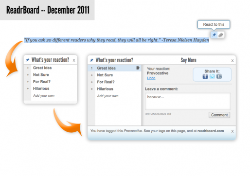
So, we asked ourselves, “what is the ONE thing this MUST do?” It seemed clear: react. The idea of losing the other functions was a system shock in a way, but we dug in on it. We would ask, “what if someone wants to react & share? React & comment?” It was always “react and _____”. That helped us realize, “oh… everything comes from a reaction. Rating, sharing, & commenting are all forms of expression that elaborate on the initial reaction or thought. So let’s start there.” At that moment, it was clear: react first, and the rest can follow. Sometimes, and more often than not, reacting is enough. (We actually have two buttons, not one: React and Bookmark. Reacting is public — others can see it — and Bookmarking is private. We think those are two distinct mindsets for the reader, so merit distinct entry points, i.e., different buttons.)
Design-wise, we’re always trying to make the widget simpler, nicer-looking, have a lighter footprint on the screen’s real estate, and look as clickable and tactile as we tastefully can. The forthcoming UI makes some great leaps in that regard.
What are you hoping will happen with the shift in functionality?
We have a product that our early beta partners are pretty happy with. There’s always more it needs to do, especially in terms of driving more page views and more traffic. ReadrBoard is literally built upon the backs of publishers — no publishers, no ReadrBoard — so we always need to be helping improve publisher metrics, engagement, brand and community.
But, we felt we could better nail the initial reader experience before moving on to ways to use reader reactions to better drive a publisher’s business — felt it could be more fun, simpler, and more satisfying.
So we’re excited enough about the new design, and feel it’s a big enough change in look-and-feel, that we held off any efforts in growing until we launched this. We’ll get it out in January and see if our assumptions are accurate, then hopefully be able to grow grow grow. The more we grow, the more value we can provide back to all of our partners.